What Maintenance Looks Like, Charted Edition
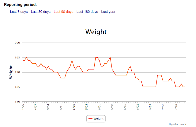
For just over 3 months now, I’ve been maintaining very well within a ten-pound window after losing a whole lot of weight over the last 11 months. Since late last August, I have gone from 258 pounds to 185 pounds, a total difference of 73 pounds (and a loss of 93 pounds since I started blogging at 278 pounds). So without further delay, here is my charted weight over the last 90 days, as recorded on My Fitness Pal:
Now, when you first look at this graph, it doesn’t scream “maintenance” at you, does it? There are a lot jumps and dips and variation… not a straight line like we want to imagine maintenance to be. But look more closely. This is *three months* passing, with my weight staying between those two lines of 185 and 195. That is excellent for someone who used to see gains of 10+ pounds in one WEEK at times, not to mention my history of gaining 40 pounds in 3 months before. If you look even more closely, you will see the stages of maintenance in there. For the first two months I stayed between 188 and 195. In the third month, it’s shifted downward and ranged from 185 to 189 pounds. I expect to stay within that range or a few pounds lower for at least another month or so.
So no, maintenance is not a straight line. There will always be fluctuation for me. I am looking at the bigger picture, here, and seeing that when there is a small jump up, there follows a small dip back down. I don’t stay up, or keep going up. I am learning to slowly and gently and CALMLY adjust my eating and activity on a daily basis to keep my weight in the range I desire. I think that will serve me well in the long term.
That’s it for now… heading out to have some summer fun!


